
ChatGPT Just Changed Again. Here's What L&D Professionals Need to Know.
GPT-5.5 Thinking and Image 2.0 dropped on the same day. Here's the field manual for every L&D role.


It wouldn’t be a month in 2026 without a model release. OpenAI released two model upgrades on the same day. GPT-5.5 Thinking and ChatGPT Images 2.0 both landed on April 23, 2026.
That’s not routine. Most updates touch one layer. This one touched two simultaneously: the reasoning layer and the visual generation layer. For L&D professionals who use ChatGPT as a serious work tool, both upgrades change what constitutes good prompting. And if you’re still prompting the way you were six weeks ago, you’re leaving real capabilities on the table.
This is your guide to what changed under the hood and how to work with it.
🧠 Model Selection Has Gotten More Consequential
Before we get to the prompts, we need to talk about model selection. Because GPT-5.5 Thinking didn’t just get better. It changed the decision you have to make every time you open ChatGPT.
The lineup now looks like this:
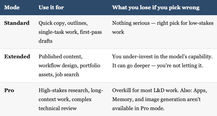
The practical shift with GPT-5.5 is behavioral, not just numerical. If you’ve been through the 5.1 to 5.2 to 5.3 cycle, you know what this means: each version shift asks something different from us, not just from the model. This one’s no different. The model needs less scaffolding than 5.4 did. You don’t need “think step by step” anymore. What it responds to now is a clear operating brief: context, constraints, output format, and a definition of done.
That’s a prompting skill shift, not just a model upgrade.
📋 GPT-5.5 Thinking — The L&D Field Manual
Here’s what changed behaviorally: GPT-5.5 Thinking is better at holding a goal across multiple steps, tracking what it’s already done, and producing a clean artifact instead of just an answer. It’s stronger at tool use, document analysis, and research synthesis.
The old pattern was “think step by step and explain your reasoning.” That prompt is weaker now. The new pattern is to give it the job, the constraints, and the definition of done.
Here’s what that looks like across four L&D roles.
Instructional Designer — Turn SME notes into a structured eLearning module outline (Standard)
Objective:
Convert the attached SME notes into a structured eLearning module outline.

Context:
This is a 30-minute compliance module for onboarding new hire customer success managers. The SME notes are unstructured — pull what matters and organize it.

Working rules:
One learning objective per section. Apply Bloom's Taxonomy levels 2-4. Flag any gaps where the notes don't support an objective.

Output:
Module title, 3-4 section headers, one learning objective per section, key content points per section, recommended assessment type.

Definition of done:
Every section has a learning objective and at least two content points grounded in the notes.
Learning Manager — Design a repeatable intake-to-launch workflow with quality gates (Extended)
Objective:
Design a repeatable L&D intake-to-launch workflow for a team using Microsoft 365, SharePoint Lists, and Articulate Rise.

Context:
We have 12 active projects, 3 IDs, and one SME review bottleneck that causes 2-3 week delays. The workflow needs to surface that bottleneck and route around it.

Working rules:
Make this operational, not theoretical. Include failure points and controls. Name which role owns each gate.

Output:
Workflow map (stages: Intake, Prioritize, SME Review, Build, QA, Launch, Measure), role-responsibility matrix, SharePoint List schema, quality gates per stage, escalation trigger.

Definition of done:
A team of 3 IDs should be able to run this without oversight within 2 weeks.
Facilitator — Design adaptive scenarios for a leadership session on feedback (Standard)
Objective:
Create 3 branching conversation scenarios for a 2-hour in-person leadership session on delivering difficult feedback.

Context:
Audience is frontline managers, 18 months or less in role. Most have avoided one or more difficult feedback conversations in the last 90 days.

Working rules:
Each scenario should have a clear wrong path and a clear right path. Make the wrong path feel tempting — not obviously bad. Include a debrief question for each scenario.

Output:
3 scenarios with setup, dialogue options (A/B/C), outcome for each path, facilitator debrief question.

Definition of done:
A facilitator with no prior training on this topic should be able to run all 3 without extra prep.
Learning Coordinator — Build an LMS course setup and enrollment brief (Standard)
Objective:
Create a complete LMS setup brief for a new compliance course launching in 10 days.

Context:
Course is built in Articulate Rise. LMS is Moodle. Audience is 240 employees across 3 departments. Completion required within 30 days of enrollment. Manager confirmation required.

Working rules:
Include every setting a coordinator needs to configure. Flag anything that requires admin access vs. coordinator access. Include the enrollment announcement email draft.

Output:
Course setup checklist (title, categories, enrollment method, completion criteria, certificate settings), enrollment email draft, manager notification template, escalation path for non-completions.

Definition of done:
A new coordinator should be able to run this launch independently using only this brief.
🎨 Image 2.0 — Why This One Matters More for L&D
Here’s the honest version: the reasoning upgrade matters. But the image upgrade might matter more for the day-to-day work most L&D teams are actually doing.

ChatGPT Images 2.0 improved four things that were real blockers before:
Text rendering is now reliable enough to use in job aids and process maps
Multi-image sets mean you can brief a full carousel or visual system in one session
Reasoning before generation means the model plans the layout before it renders
Instruction following means your detailed visual constraints actually hold
One thing worth noting: instruction-following is strong on spatial rules, text content, and object placement. It’s weaker on directed character behavior — getting a person to look at a specific off-center object rather than forward at a screen took four rounds and was never fully resolved. That’s the current frontier. Worth knowing before you brief a scenario sequence.
For L&D, that translates to training assets, scenario illustrations, job aids, process diagrams, course covers, and LinkedIn carousels that you couldn’t reliably generate before.
One more shift worth calling out: the palette you specify matters more than it used to. For editorial illustration and job aids, brand colors work well. For UI-style decision guides and comparison tables, force the palette to match the content’s natural visual logic — light/medium/dark tiers, dark mode cards, whatever the content demands. Forcing brand colors onto a decision guide produces awkward results. The model understands design system references — “Vercel docs aesthetic” or “Linear changelog style” gets you further than describing hex codes in isolation.
The old prompting pattern visually described what you wanted. The new pattern is writing a creative brief: Goal, Composition, Style, Palette, Must avoid, Quality bar. Treat it like briefing a designer, not typing a search query.
Here’s what that looks like across four L&D roles.
Instructional Designer — Scenario illustration for an eLearning safety module
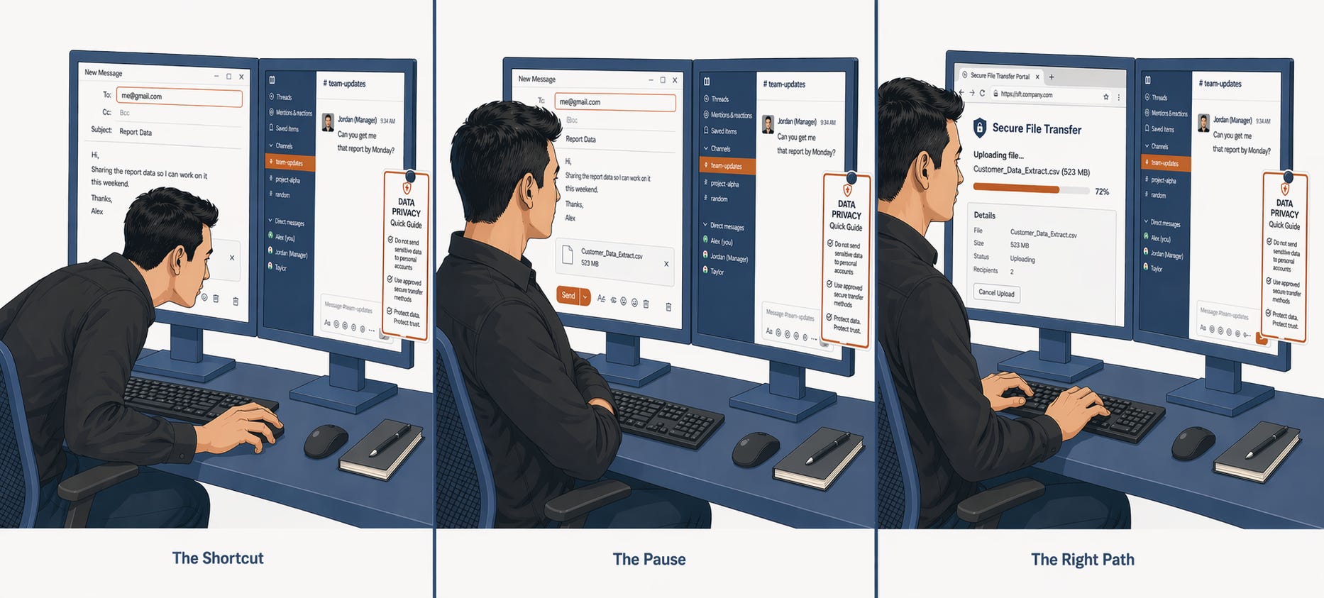
Create a 16:9 scenario illustration for an eLearning module on workplace safety.

Goal:
Show the moment before a near-miss incident in a warehouse setting. The learner should see two paths: one safe, one risky.

Composition:
Foreground: worker at a conveyor belt, facing a choice — proper PPE on a hook to the left, a faster but unguarded shortcut to the right. Left side is brighter and cleaner. Right side is dimmer with a caution shadow.

Style:
Clean flat editorial illustration. Modern workplace safety manual aesthetic. Not cartoonish. Not photorealistic.

Palette:
Paper White #FAFAF8 background. Slate Blue #2D4A6B structural elements. Copper #B5541F hazard indicator on the right path. Soft sage green for the safe path.

Text:
No text in the image.

Must avoid:
No dramatic injury scenes. No shock imagery. The moment of choice, not the consequence.

Quality bar:
Professional enough to appear in a Fortune 500 compliance module.
A note on iteration: the scenario sequence above took four rounds. Screen content, character consistency, and desk layout all held from round one — Image 2.0 follows spatial and object instructions reliably. Directed gaze — getting the character to visibly look at the card rather than the screen in the Pause panel — stayed just out of reach. The behavioral shift reads in the screen content, but not fully in the body language. That’s the current frontier. Worth knowing before you brief it.
Learning Manager — Operating model diagram for a portfolio case study (Extended)
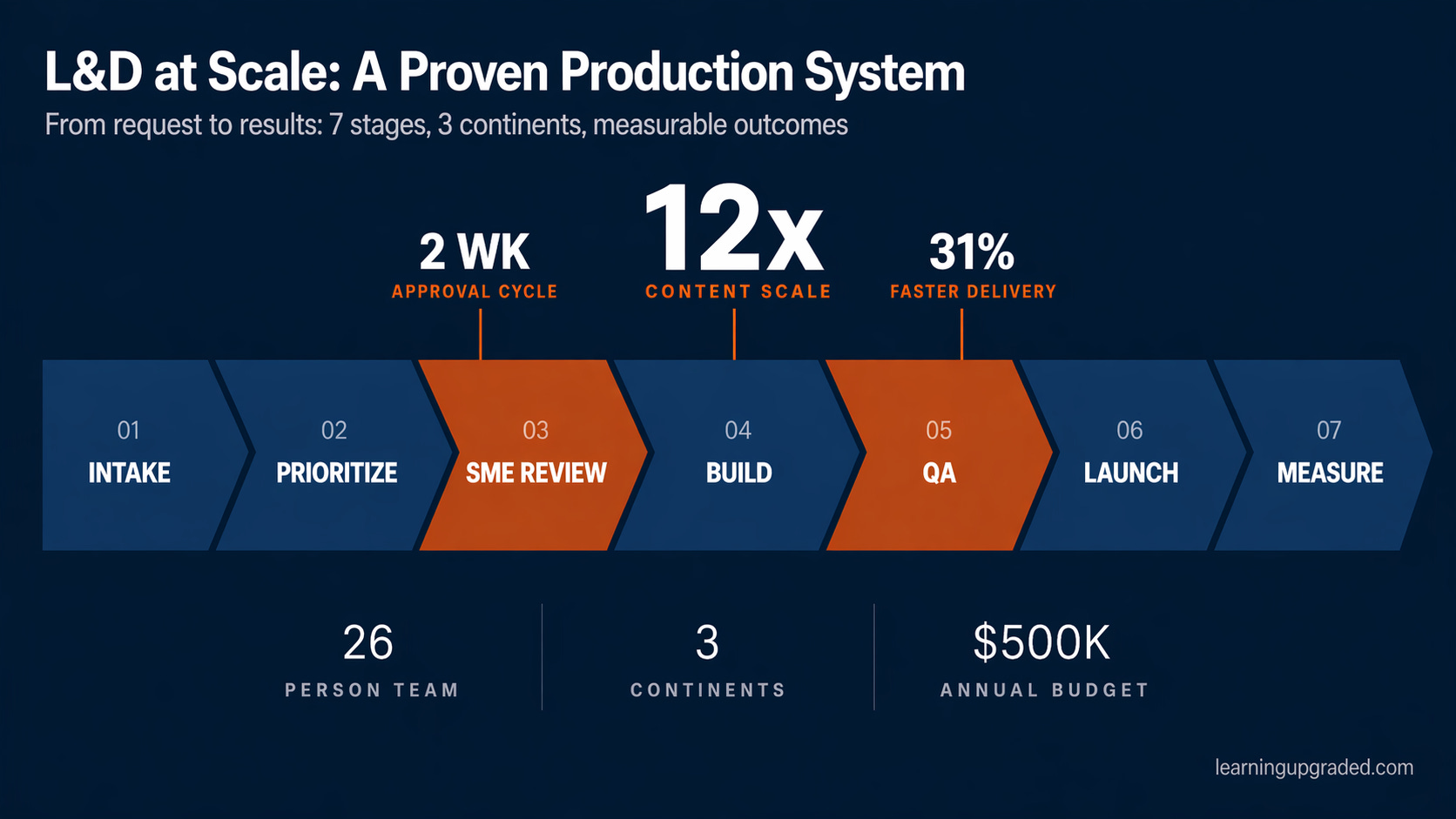
Create a wide 16:9 professional L&D operating model diagram. Board-deck quality.

Background:
Full bleed deep Slate Blue #1E2E42. Dark canvas throughout.

Action title (top-left):
Line 1 — large bold Paper White #FAFAF8: "L&D at Scale: A Proven Production System"
Line 2 — smaller medium weight Paper White at 60% opacity: "From request to results: 7 stages, 3 continents, measurable outcomes"

Pipeline row (vertically centered):
Seven interlocking chevron blocks in a continuous chain. Right edge of each block is a sharp point fitting into the left notch of the next — zero gaps. First block flat left edge, last block flat right edge.

Block fills:
01 INTAKE and 02 PRIORITIZE: Slate Blue #2D4A6B
03 SME REVIEW: Copper #B5541F
04 BUILD: Slate Blue #2D4A6B
05 QA: Copper #B5541F
06 LAUNCH and 07 MEASURE: Slate Blue #2D4A6B

Inside each chevron: step number (01-07) in Paper White at 45% opacity, small light weight. Stage name bold Paper White all-caps below.

Metric callouts (floating above three blocks):
Above BUILD (04) — PRIMARY, largest (1.4x other callouts): "12x" bold Paper White + "CONTENT SCALE" Copper small caps
Above QA (05) — SECONDARY: "31%" bold Paper White + "FASTER DELIVERY" Copper small caps
Above SME REVIEW (03) — TERTIARY: "2 WK" bold Paper White + "APPROVAL CYCLE" Copper small caps

All three callouts at identical vertical height. Thin Copper connector lines, equal length, dropping to top of each chevron. Floating text only — no badge boxes.

Stat row (below pipeline):
Three columns, evenly spaced. Each: large medium-weight number in Paper White + small all-caps label in Paper White at 45% opacity.
Column 1: "26" / "PERSON TEAM"
Column 2: "3" / "CONTINENTS"
Column 3: "$500K" / "ANNUAL BUDGET"
Thin vertical rules between columns at 15% opacity. No background strip.

Footer: "learningupgraded.com" bottom-right, Paper White at 35% opacity.

Must avoid:
No badge boxes on callouts. No gradients. No icons. No rounded corners. No gaps in chevron chain. Stat numbers clearly lighter weight than callout numbers.

Quality bar:
A Chief Learning Officer puts this on slide 3 of a board presentation without modification.
A note on iteration: the operating model diagram took five rounds. Round one produced clean rectangular blocks on a white background — functional but generic. It needed a full prompt rewrite, not an edit. The rebuild introduced the dark canvas, interlocking chevron chain, floating metric callouts, and a weighted visual hierarchy, drawing on consulting deck design principles. Rounds three and four tuned the details: stat numbers were initially too bold and competed with the metric callouts, connector lines were of unequal lengths, and label tracking was inconsistent. Round five fixed a stray hyphen that the model introduced in the subtitle. The lesson: board-deck quality work runs four to five rounds by default. That is the expected workflow for this asset type, not a sign that something went wrong.
Facilitator — Session cover image for a psychological safety workshop

Create a 16:9 slide cover image for a leadership development workshop on psychological safety.

Goal:
Convey that speaking up feels risky — and that's exactly why it matters.

Composition:
A single person standing at the edge of a geometric platform, looking out at a vast open space. The space beyond is calm and inviting. The platform edge is the tension point — the moment of deciding to speak.

Style:
Modern editorial illustration. Minimal. Emotionally resonant. Think McKinsey Quarterly meets a Brene Brown book cover.

Palette:
Deep Slate Blue #2D4A6B background. Copper #B5541F geometric platform edge. Paper White #FAFAF8 figure silhouette. Soft warm light from the open space.

Text:
No text. The facilitator will add the workshop title as a text overlay.

Must avoid:
No generic corporate meeting scenes. No raised hands. No group huddles. No inspirational sunrise clichés.

Quality bar:
An image a thoughtful leadership development firm would commission.
Learning Coordinator — Job aid process map for LMS enrollment
Create a clean process map for a one-page job aid on the LMS enrollment process.

Goal:
Show the 6-step enrollment workflow so a coordinator can follow it independently.

Format:
Portrait, optimized for print and digital display.

Composition:
Vertical top-to-bottom flow with labeled blocks and downward arrows:
Step 1: Receive course request
Step 2: Confirm course settings in LMS
Step 3: Upload SCORM/Rise package
Step 4: Set enrollment rules and deadline
Step 5: Send enrollment announcement
Step 6: Monitor completion dashboard

Small icon area on the left of each block. Copper highlight marker on Step 4 — the most common failure point.

Style:
Clean flat design. Job aid aesthetic — functional, not decorative. Works at A4 print size.

Palette:
White background. Slate Blue #2D4A6B step blocks. Copper #B5541F highlight on Step 4. Light Sand #E8D5A3 icon background areas.

Text:
Use exact step labels above. Sub-labels under each step, max 6 words.

Must avoid:
No decorative gradients. No shadows. No rounded corporate icons. Clarity over style.

Quality bar:
A new coordinator should be able to follow this on day one without additional explanation.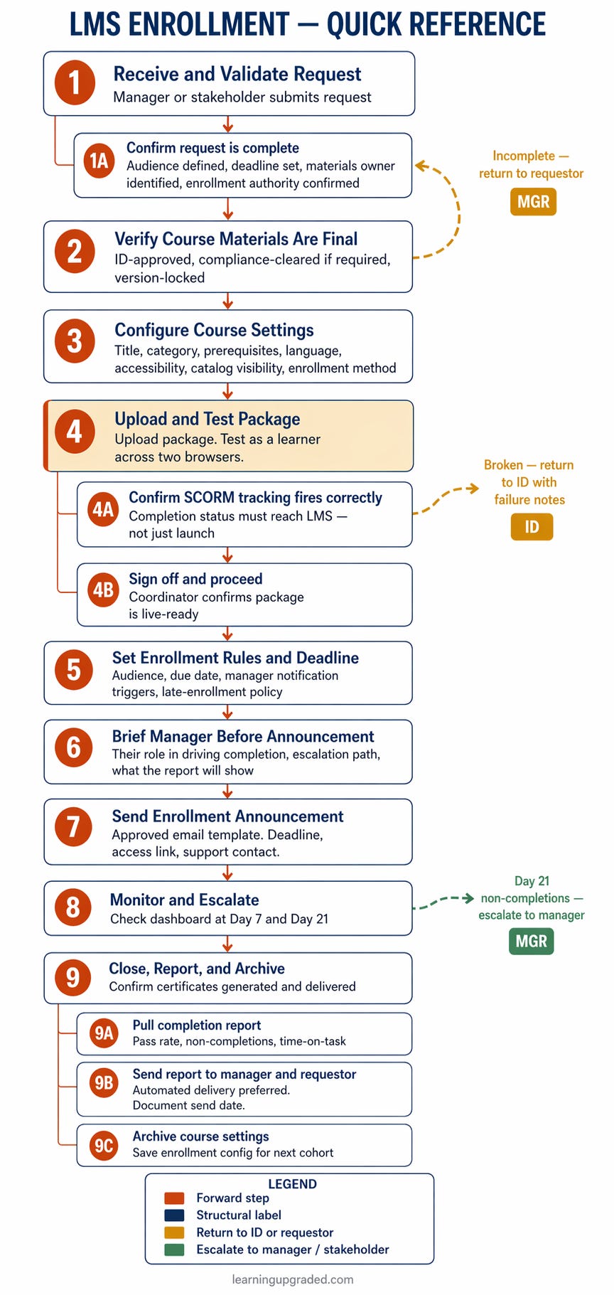
A note on iteration: the diagram above took two rounds. The first generation got the structure right — steps, sub-steps, all four colors, every label accurate. The second corrected one arrow origin point and changed the legend border from dashed to solid. For a job aid this detailed, that’s a reasonable trade. A year ago this wasn’t possible at all.
That’s the honest story with Image 2.0. The question isn’t “will it work?” anymore. It’s “how many rounds does it take?” For a complex job aid, the answer is two. For a board-deck diagram built to consulting standards, the answer is five. That’s a different tool than what we had — and understanding the range helps you plan your time.
🗺️ The New Operating Model
Model selection is no longer just a technical preference. It’s a judgment call that affects the quality of what comes back.
Here’s the decision guide:
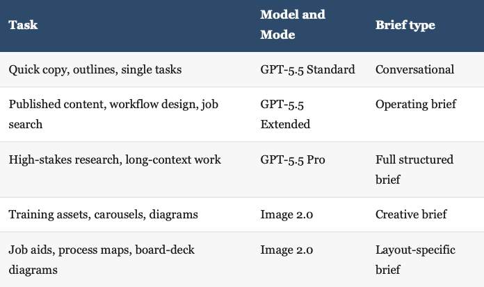
Both models moved forward. The limiting factor isn’t the model’s capability anymore. It’s the quality of the brief we give it.
That’s the shift worth taking seriously.